
How to Make Responsive Tables
How to Make Responsive Tables - In this tutorial, I will share responsive data table designs that are simple, lightweight but still elegant and have excellent accessibility for users, and that I did only by using basic CSS and HTML with very small size because I Understand, your web pages may require more variations in data tables that are responsive and do not overload website loading.
 So just go ahead, take the responsive css table below and save or install it in your website's css collection, for blogger users, please place the css data table above the code]]> </ b: skin> or </style>.
 HTML Table (2 Column)
HTML Table (3 Column)
 HTML Table with List
Responsive demo table with a list or list (number list)
 Table Specifications

table th{color:#1e1e1e}table caption{color:#1e1e1e;font-size:17px;font-weight:700;text-transform:uppercase}table.data,main table{width:100%;background-color:#fff}table.number_list th:first-child{width:26px;text-align:center}table.data th,main table th{background-color:#007b37;color:#fff}table.data th[scope=col],main table th[scope=col]{border-bottom:grey 1px solid}table.data th[scope=row],main table th[scope=row]{border-right:grey 1px solid}table.data,table.data th,table.data td,main table,main table th,main table td{border-collapse:collapse;border:1px solid #ccc;vertical-align:top}table.data td,table.data th,main table td,main table th{padding:4px}table.data th,main table th{font-weight:700}table.data td,main table td{background-color:#fff!important}Then, to create a table in the posts page, please use the following html table data via HTML editing mode instead of Compose as in the following example;

table th{color:#1e1e1e}table caption{color:#1e1e1e;font-size:17px;font-weight:700;text-transform:uppercase}table.data,main table{width:100%;background-color:#fff}table.number_list th:first-child{width:26px;text-align:center}table.data th,main table th{background-color:#007b37;color:#fff}table.data th[scope=col],main table th[scope=col]{border-bottom:grey 1px solid}table.data th[scope=row],main table th[scope=row]{border-right:grey 1px solid}table.data,table.data th,table.data td,main table,main table th,main table td{border-collapse:collapse;border:1px solid #ccc;vertical-align:top}table.data td,table.data th,main table td,main table th{padding:4px}table.data th,main table th{font-weight:700}table.data td,main table td{background-color:#fff!important}If you want to create a 4 column and 5 row data table, use the following html code and replace the text or contents of the data according to what you want to input into the table.
HTML Table (3 Column)
<table class="data">HTML Table (4 Column)
<caption>Teks Table Caption Disini</caption>
<thead>
<tr><th scope="col">Column 1</th><th scope="col">Column 2</th><th scope="col">Column 3</th></tr>
</thead>
<tbody>
<tr><th scope="row">Row 1</th><td>Data</td><td>Data</td></tr>
<tr><th scope="row">Row 2</th><td>Data</td><td>Data</td></tr>
<tr><th scope="row">Row 3</th><td>Data</td><td>Data</td></tr>
<tr><th scope="row">Row 4</th><td>Data</td><td>Data</td></tr>
<tr><th scope="row">Row 5</th><td>Data</td><td>Data</td></tr>
</tbody>
</table>
<table class="data">You might want to look at this responsive demo table, before applying it to the website, please test the following responsive data demo table on various screen sizes (deice)
<caption>Teks Table Caption Disini</caption>
<thead>
<tr><th scope="col">Column 1</th><th scope="col">Column 2</th><th scope="col">Column 3</th><th scope="col">Column 4</th></tr>
</thead>
<tbody>
<tr><th scope="row">Data 1</th><td>Data 2</td><td>Data 3</td><td>Data 4</td></tr>
<tr><th scope="row">Data 2</th><td>Data 2</td><td>Data 3</td><td>Data 4</td></tr>
<tr><th scope="row">Data 3</th><td>Data 2</td><td>Data 3</td><td>Data 4</td></tr>
</tbody>
</table>
Responsive Data Table

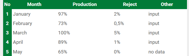
<table class="data number_list">Specifically to create a table with a list or list (number list), use the following html table code, while the responsive table css code that is used is still the same.
<caption>Teks Caption Disini</caption>
<thead>
<tr><th scope="col">No</th><th scope="col">Month</th><th scope="col">Production</th><th scope="col">Reject</th><th scope="col">Other</th></tr>
</thead>
<tbody>
<tr><th scope="row">1</th><td>January</td><td>97%</td><td>2%</td><td>input</td></tr>
<tr><th scope="row">2</th><td>February</td><td>73%</td><td>0,5%</td><td>input</td></tr>
<tr><th scope="row">3</th><td>March</td><td>100%</td><td>5%</td><td>input</td></tr>
<tr><th scope="row">4</th><td>April</td><td>89%</td><td>1%</td><td>input</td></tr>
<tr><th scope="row">5</th><td>May</td><td>65%</td><td>0%</td><td>no data</td></tr>
</tbody>
</table>
Responsive demo table with a list or list (number list)
- Responsive design and support in many types of browsers (IE, Firefox, Chrome, Safari, Opera)
- Light (does not affect website loading speed)
- Table fonts follow font settings on web pages
- Easy to install on any website (blogger, wordpress etc.)
- Forever free
0 Response to "How to Make Responsive Tables"
Post a Comment